/category/blog/
50th Anniversary of dealing – Part 2
In the 70s and 80s I was buying prints by such artists as Hiroshige, Hokusai, and Utamaro in the UK and in France and selling them in Japan. In Japan, I was buying prints by Yoshitoshi and Kuniyoshi. At that time those artists were not so highly valued by Japanese collectors.
I travelled to Paris every ten days or so and on almost every trip I was able to find something good. A lot of prints had been exported to France in the 19th century. Japanese art and culture enjoyed great influence in France at that time, the importance of ukiyo-e for the French impressionists is well known. Now it is difficult to find good quality prints in France and the prices fetched in auctions are often prohibitive.
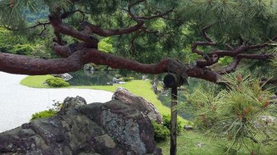
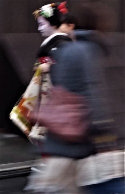
At the time of my early trips to Japan in the 70s, there were not so many European or American visitors to Tokyo, visitor numbers to Japan were in the low 100,000s. Now visitor numbers are approaching 25 million per annum. My first experience of central Tokyo was a revelation – a real shock of the new! Tokyo’s highrise office blocks, its modern and efficient transport system, the bullet train all made London feel quite parochial. Because I had been studying ukiyo-e, Kyoto seemed much more familiar to me – if you squinted it was like being in a Hiroshige landscape.
My days were tiring ones of walking around shops in both cities. Prints could turn up anywhere. Outside of the cities it was not unusual for me to be followed by a gaggle of children for whom I was clearly a source of curiosity and general amusement.
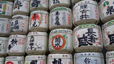
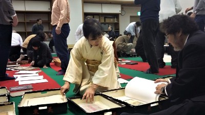
I attended various auctions in Japan and often I was the only foreign dealer. The auctions were smaller then and some were held in ryokans in locations such as Hakone. Some dealers wore old style Japanese clothes (montsuki kimono beneath the montsuki haori and hakuma with socks and sandals). Everyone sat on tatami mats, the prints were passed around and bids were written on slips of paper in cardboard holders which were then thrown to the auctioneer. It was considered polite to bid on every few prints even if you didn’t want them; this was a matter of some delicacy which entailed making a bid low enough so as not to buy the item, but of course not so low that it would cause offense. Payment was cash only. Nowadays the accounts are computerised but in those days we had one man who did all the accounting on an abacus and would match a computer for speed. The auction was followed by dinner and then a dip in the communal male pool with much joshing.
At that time there was little interaction between Japanese dealers (except at these small auctions) and it was quite possible to buy a print from one shop, walk down the street and sell it to another shop because the dealers never went into each other’s premises. Over the years this has changed – as has so much else. I have been in the business for so long, I find myself dealing with the sons, daughters and sometimes the grandchildren of the dealers I met when I first travelled to Japan. I think that the aptitude for dealing and most importantly a good ‘eye’ must be carried in the genes.
The modern successor to those auctions is the official dealers’ auction held a number of times a year in the centre of Tokyo. They are much larger affairs with more foreign dealers and the ‘shout bid’ system mainly being used.
I was the first dealer to actively buy and champion surimono. In 1975 I had an exhibition of them and issued several catalogues of surimono over the following years. Then, as now, in fine surimono you can find exquisite sophistication in the cutting and printing of these short run editions for various poetry groups. In the 70s these wonderful prints were surprisingly affordable. Many surimono were exported from Japan in the latter part of the 19th century when there was a big demand for them, especially in Europe. To cope with this demand, from time to time, copies of surimono were produced. I think that the reasons that other dealers had avoided surimono in those early days was because of the risk of fakes and also expertise was determined by who had the opportunity to handle the genuine items. Because of the large number exported, curiously it was easier to find authentic surimono in France than it was in Japan.
In the Part 1 of this 50th anniversary blog I wrote about the importance of a good reference library, but to really know prints you also have to hold them in your hand. When handling prints the quality of the impression and of the paper is immediately evident. Surimono were printed on the finest of hosho which is a heavier paper that could hold the calligraphy, blind printing, and the addition of gold and other metals.
Another specific area in which I had an interest, which I still have to this day, is Shijo material: books, prints and paintings. In those early days Shijo was not considered collectable or as appreciated as formal styles. This changed somewhat after the publication of Jack Hillier’s The Uninhibited Brush in 1979.
Over the years I have noticed that prints travel in circles and I occasionally buy back the same items. I was passing an antique shop in the centre of Tokyo one time when I saw a first edition Hiroshige hanging on the wall. On inspecting it I realised that I had previously owned it. It was a very fine print so I purchased it again from that antique shop. That print had travelled between Japan and Europe four times to my certain knowledge. As it was some time ago, I am not sure where it went onto when I sold it next – it could be anywhere by now, I just hope that it has been cared for and is still in good condition.
I have had the pleasure of selling to many fine collectors. Then, as now, people find pleasure in their prints in different ways. For many years I sold Hiroshiges to one collector. She was a charming, elderly lady who one day confided to me that, whilst she loved the landscapes, she didn’t really like the bright colours. She told me that she had arrived at a method to get the colour saturation just as she liked it: she placed the prints in full sun on her balcony with pebbles on each corner and left the colours to fade until she was satisfied. Whilst I remember her fondly I do wince when I think of mint condition prints being intentionally faded.
Especially at this time when fine prints are increasingly difficult to find, I think of dealers and collectors alike as custodians for the next generations. I ask that you please look after your prints sensibly. Prints should be stored in acid free paper away from light and damp. They can be displayed but should be kept away from direct sunlight and rotated occasionally; and ideally not sealed in frames so that they can breathe.

About two years ago I viewed an auction in London that had four surimono. I saw that they were purchased from me about 20 years ago. My price for these surimono, which at that time were in pristine condition, was £25. Unfortunately, they had been stored somewhere damp and their condition was very poor. If they had been well looked after and had remained in fine condition I would have happily paid £2000 each for them but, as it was, I didn’t consider buying them. Many prints have become ghosts of their original selves because they have not been sensibly looked after.
I should like to thank those of you who are collectors and those who are interested in the research that I have done over the years; warm thanks to my colleagues for their companionship and shared knowledge; and last but not least, thanks to my wife Lynne for her interest and invaluable help in the business.
In this year of the 50th anniversary of dealing I look forward to continuing to offer fine prints, paintings and books for many years to come.
Richard Kruml 2018
50th Anniversary of dealing – Part 1
Looking back on 50 years of dealing in Japanese prints, paintings and books I have much to be grateful for. From the first ukiyo-e print that I bought in 1968 to now when I have bought and sold many tens of thousands of prints. In researching specific prints I have built up my kno
wledge of the artists and the artisans involved in print production. I continue to learn about the history, culture, and society that all gave rise and shaped what we know as ukiyo-e. Handling and knowing this art of 17th to 19th century Japan has been, and continues to be, a great pleasure and privilege for me.
I was fortunate that when I began as a dealer, it was at a time when prints were readily available and there was a wave of interest in Japanese art. I came to dealing after working as a professional photographer for a few years in London in the ‘swinging 60s’. I started buying and selling prints – initially book plates, Hogarth prints, maps and caricatures, I had a stall in an antiques market and was beginning to almost make a living. In 1968, by chance, I went into a shop just off Charing Cross Road that sold Japanese antiquities. On the wall was a print of a samurai by Kuniyoshi. I was familiar with engravings and etchings but I had never seen a printing technique like that. I was so excited by the print that I paid £40 for it – an extravagant price at that time! I put it on my stall in the Antique Centre near Selfridges. It took me three years to sell it and I made a big loss. This was the beginning of my education as a Japanese print dealer. I am often asked “How do I become a dealer?” My answer is: spend money, make mistakes, and keep learning.
Fortunately, not all of my learning was as a result of expensive mistakes, my first coup was finding Hokusai’s Great Wave in an outside antique market. It looked genuine but I wasn’t certain because I had never had one before. I paid the price of £10 which by today’s standards is insignificant (an impression of the Great Wave recently sold for about £720,000) and rushed to the Westminster Central Reference Library and pulled out all the books with illustrations of the Great Wave. I quickly discovered how much the prints varied and learned that no two impressions of any woodblock print can be absolutely identical. Since that personal ‘light bulb’ moment I have built up my knowledge of many individual designs. From learning to look for small breaks in the key block and other irregularities that should be repeated on each genuine impression of the Great Wave, I have gone on to become knowledgeable about many other specific wood blocks; learning about the often significant changes made when the blocks were recut, the histories of repairs and the history of the unique wood grain as it wears with each impression. I also learned about how much the pigments can vary in different impressions. The placing and wiping of the pigment will subtly differ and runs of prints on separate days can result in different hues or even very different colours. Climate conditions at the time of printing also affected the print quality. [For more information on the techniques of woodblock printing you might be interested to refer to my Chapter: The Technique of Japanese Printmaking in Ukiyo-e to Shin hanga, The Art of Japanese Woodblock Prints, Magna Books, 1990.]
It was then that I recognised the value of a good reference library and now I have hundreds of reference books and monographs on ukiyo-e artists which I use in my cataloguing. A few of the reference books that I refer to most regularly include are in blog [Selected Reference Titles] A word of warning: whilst most books illustrate genuine impressions – not all of them do!
In the 1970s, prints were, for the most part, affordable and relatively easy to find in London and the home counties. I used to take my car, an old Morris Traveller, to make buying trips around the countryside – I always found something to buy. (I still regularly make buying trips but now it means travelling worldwide.) Prints turned up in the most unusual places: two first edition Hiroshige snow scenes were found in the lining of a large wooden trunk in Scotland; decades later, I was offered an album of Kunisada that had been found sticking out of a dustbin in Hampstead!
In the 70s there were prints to be found in the market on Portobello Road. On one occasion it took some guile to acquire the item I wanted. There was a dealer who had Japanese prints amongst other items in an antique arcade. He was well known for his reluctance to sell to other dealers. One Saturday I walked in and looked through a pile of Hokusai reproductions, all priced at £5. Amongst the reproductions there was a completely genuine Hokusai in fine condition. (It happens sometimes that a fine condition print looks almost ‘too good’ and it is assumed to be a reproduction.) I thought that he would refuse to sell it to me – knowing that I only dealt in fine prints he would be suspicious that I wished to buy a reproduction. I left the shop as nonchalantly as I could so that I could think about what to do. With a bit of astonishing good luck – walking down the street came a client of mine who at the time worked for JAL and would always come and see me on his stop over. I told him the situation and he agreed to help me. He was successful in buying the genuine Hokusai print (at the cost of a reproduction). The next time I was in the arcade and saw that dealer, I could tell by his expression that he had had time to think about the transaction and had guessed what had happened.
In the 70s Knight, Frank and Rutley (the well-known estate agents) had a saleroom just off Bond Street and had regular weekday antique sales. Japanese prints frequently came up amongst the furniture. At one of these auctions a large pile of Hiroshiges came up. I could only afford £1 per print and was outbid. It is common for dealers to have a personal history of ‘ones that got away’ – those Hiroshiges were the first for me in that category and to this day I still wish that my budget had been bigger and still wonder what happened to them.
By the late 70s I had moved my business from the antiques market into a small shared gallery off Bond Street. The gallery was on the ground floor and faced a restaurant across a narrow street. I could see diners enjoying their lunch and they could see me at work. One day a Japanese dealer came to see me. He selected a pile of prints, and after some negotiation we agreed a price. At this point in the story, the position of the restaurant diners becomes important. As the dealer prepared to pay me, he turned his back to me and (oblivious of the diners opposite), he dropped his trousers to expose long johns and somewhere between his legs a bag of cash. Across the road knives and forks froze in mid-air, all conversation and service paused while this corpulent dealer revealed a little bit more than his security arrangements.
End
You may be interested to read further reminiscences from my early years of dealing in Part 2 which will soon go live on the website together with the 50th Anniversary special update.
Selected Reference Titles
Listed here are selected titles of reference books that I refer to most regularly – this is not an exhaustive list!
Asano, Shugo and Clark, Timothy, The Passionate Art of Kitagaway Utamaro, Asahi Shimbun, 1995
Forrer, Matthi and Goncourt, Edmond de, Hokusai, Rizzoli International Publications, 1988
Gentles, Margarent O., The Clarence Buckingham Collection of Japanese Prints, Volume 2 Haranobu, Koryusai,Shigemasa, their followers and contemporaries , The Art Institute of Chicago, 1955
Gunsaulus, Helen C., The Clarence Buckingham Collection of Japanese Prints, Volume 1 The Primitives, The Art Institute of Chicago, 1955
Hillier, Jack, The uninhibited brush, Japanese Art in the Shijo Style, Hugh M. Moss Ltd, 1974
Hillier, Jack, The Art of the Japanese Book, 2 volumes, Southeby Publications, 1987
Hirano Chie, Kiyonaga A Study of His Life and Works, Harvard University Press 1939
Keyes, Roger, The Art of Surimono, Privately Published Japanese Woodblock Prints and Books in the Chester Beatty Library, Dublin, Southeby Publications, 1985
Keyes, Roger, The Art of Surimono, two volumes, Southeby Publications, 1985
Koop, Albert J., and Ianda, Hogitaro, Japanese Names and How to Read Them, Routledge & Kegan Paul Ltd., 1923
Lane, Richard, Images from the Floating World, The Japanese Print Including a Dictionary of Ukiyo-e, Oxford University Press, 1978
Mitchell, C.H., The Illustrated Books of Nanga, Maruyama, Shijo and Other Related Schools of Japan, Dawson’s Book Shop, 1972
Robinson, B.W., Kuniyoshi, The Warrior Prints, Phaidon Press, 1982
Schaap, Robert, Heroes & Ghosts, Japanese Prints by Kuniyoshi 1797 – 1861, Hotei Publishing, 1998
Suzuki, Juzo, Utagawa Hiroshige, The Nihon Keizai Shimbun, 1970
Tamba, Tsuneo, The Art of Hiroshige, Asahi Shimbun, 1965
Turk, Frank A., The Prints of Japan, Arco Publications, 1966
Van den Ing, Eric and Schaap, Robert, Beauty & Violence, Japanese Prints by Yoshitoshi 1839 – 1892, Havilland Press, Society for Japanese Arts, 1992
Nishikawa Sukenobu, 1671-1750

Given names: Bunkado; Bunkadô; Fujiwara; Jitokusai; Jitokusō; Magoemon; “Uji” Nishikawa; Nishikawa Nishikawa Sukebê /Sukebê; Nishikawa Sukenobu; Saiō; Sukenobu; Uemon; Ukyô; Ukyō; Yûsuke
Sukenobu was “The most accomplished and influential Ukiyo-e painter in Kyoto during the first half of the eighteenth century” [1]. He was born and died in Kyoto, the centre of the Imperial Court, home of the classical arts and aristocratic custom. It is this tradition that permeates Sukenobu’s prolific work. Contemporaries studied his books and prized his paintings of single figures and groups of females. He “influenced Masanobu directly, Harunobu profoundly and almost all subsequent ukiyo-e artists indirectly” [2].
In the years in which the ukiyo-e style was emerging from the publishing district of Edo, Sukenobu was training from a young age in the painting styles of Kano school artist Kano Eino and Tosa school artist Tosa Mitsusuke, (from whom he may have derived the Suke- in his name). Whilst ukiyo-e prospered and grew in Edo, it also developed in the Kamigata area (Osaka and Kyoto) which produced its own style and masters. Of the Kamigata artists Sukenobu led the genre – he produced thousands of illustrations and would remain amongst the most prolific ukiyo-e artists of the entire Edo period.
His images were almost exclusively in monochrome. Sukenobu produced no single-sheet prints.
The beginning of ukiyo-e style and Sukenobu’s prodigious output took place in the Genroku era, 1688-1704, a period of great wealth amongst the merchant classes of Osaka, Kyoto and Edo. These cities expanded and saw the emergence and flowering of an urban popular culture: “the later part of the Genroku era around 1700… the townspeople as a class had reached a high degree of affluence and culture, and the artistic impulse in Japan in general was more vital and widely diffused, less shaped by traditional influences, since it was no longer in the service solely of the aristocracy. At this time, too the artists of the Ukiyo-e school… prefixed to their signatures “Japanese painter” to indicate their allegiance to the new point of view” [3].

Sukenobu produced book illustrations and other works of popular art around 1698. He then began working with the Hachimonjiya publishers/booksellers, producing illustrations for ukiyo-e zōshi (“ukiyozōshi” first appeared in about 1710 in reference to erotic works, but the term later came to refer to literature that encompassed a variety of subjects and aspects of life during the Edo period) and yashusha hyôbanki (hyôbanki were compilations of rankings and critiques of kabuki actors and courtesans and were important elements in the urban popular culture of the period), and other works. His name first appeared on the colophon for a book in 1708, and the first illustrated book (ehon) he fully designed himself was published in 1723.
From these beginnings – he quickly became pre-eminent as an ukiyo-e book illustrator in Kyoto. He was a prolific designer of picture-books designing well over 100. (Indeed, Lane gives the number at around 200, but he may have been counting multiples as 3, 10, etc.) What is remarkable is the high standard and inventiveness maintained across this output.
Of particular interest is his rendering of different classes of women of this period. In his first major work of 1723, Hyakunin joro shinasadame, “One Hundred Women Classified According to their Rank” – this illustrated book, as others of his works, show female figures from various classes including courtesans, always elegantly drawn no matter what their occupation. This publication was banned by the government for lese-majeste (crimes against the monarch).
Ukiyo-e expert Richard Lane writes that Sukenobu’s style was profoundly influential, and his images of beauties are characterised by a “subdued conception of lovely, unobtrusive grace (perhaps closer to actual Japanese womanhood than that of any other artist)” [4]
Sukenobu is also known for his shunga, producing some of the finest in the genre. Between the years 1710 and 1733, at least thirty volumes of erotica designed by him were published; roughly one-third of these were published between 1719 and 1722.
Serious interest in the decorative arts was characteristic of 18th century Japan. Sukenobu was known for his creativity and taste in inventing kimono designs. He was commissioned on several occasions by kimono-makers to create textile designs for them and he illustrated kimono pattern books.
The painting Beauties near Water (Suihen bijin zu 水辺美人図) offered on this update shows a typical Sukenobu figure: A plump face and a graceful and sensuous stance so often seen on the pages of his books.
For some examples of other paintings held in museum collections please follow links below:
Woman and Attendant, Three Girls having Tea, Metropolitan Museum of Art : Metropolitan Museum of Art.
Clock and the Beauty, Tokyo National Museum : Clock and the Beauty, Tokyo National Museum .
British Museum : British Museum.
[1] – Timothy Clark, Ukiyo-e Paintings in the British Museum, Smithsonian Institution Press, 1992, p83
[2] – James Albert Michener, The Floating World, University of Hawaii Press, 1983 p. 376
[3] – Mailey, Jean. “Four Hundred Winters … Four Hundred Springs ….” Metropolitan Museum of Art Bulletin, New ser., v. 18, no. 4 (December, 1959)
[4] – Lane, Richard. Images from the Floating World. New York: Konecky & Konecky, 1978. pp58.
Maki Bokusen (1736-1824)

Given names: Bokusen; Maki-Nobumitsu Bokusen; Gekkotei; Hokusen; Hokutei; Hyakusai; Maki Shin’ei; Suke-emon; Tokoro; Utamasa.
Bokusen was a Nagoya samurai of the local Owari Fief and ukiyo-e painter, printmaker and copperplate etcher. He was a student of Utamaro and also, as C H Mitchell states, a friend and acknowledged pupil of Hokusai although much of his work bears little resemblance to that of Hokusai.
Bokusen is known for his collaboration with Hokusai on the master’s Manga: It seems that the idea was conceived when Hokusai, at Bokusen’s invitation, went to Nagoya for an extended visit in 1811/12. Hokusai stayed for six months with Bokusen and during this time developed a circle of students and successfully cultivated his popularity in Nagoya. Hanshu Sanjin in his 1812 preface to Volume One of Hokusai’s Manga writes that over 300 spontaneous drawings were made during this visit. And this is what possibly inspired Bokusen to approach the legendary Nagoya publisher Eirakuya Toshiro, who had previously published illustrated book(s) by him, to turn Hokusai’s sketches into a book. Bokusen and another of Hokusai’s students, Tonansai Hokuun, are credited as copying Hokusai’s drawings in preparation for the woodblock cutter as the term “ko” or “revisers” is used in the colophon, suggesting that it was the two pupils who arranged the varied sketches.
Bokusen’s own published works include:
c1809 Kyogaen shohen. (Mad Sketches)
1809 Bokusen gafu (Album of Sketches by Bokusen)
1810 Hitoyo banashi (One Evening’s Talk)
1813 Shiki sanbaso (The Sanbaso in Four Seasons)
1814 Mushi no koe (Songs of insects). Bokusen and other artists
1815 Bokusen soga shashin gakuhitsu (Various Dreamings by Bokusen: A Study in Truthful Painting)
1816 Santei gafu. Bokusen and Hokusai publish a Manual for Illustration in Three Styles. The illustrations in this publication apply shin, gyo, and so styles to depict a range of subjects
1822 Kusa no na shu (Aki) (Collection of Autumn Grasses). Various artists including Bokusen
1823 Ippitsu gafu (A Book of Drawings Made by One Stroke of the Brush) Hokusai assisted by Bokusen
1827 Kusa no na shu (Haru fuyu) (Collection of Spring and Winter Grasses). Various artists including Bokusen


Bokusen’s work in copperplate etching is not well known to collectors of ukiyo-e, certainly not compared with his better recognised contemporaries Kokan (1747-1818) and Denzen (1748-1822) who used the technology for familiar subjects such as famous views of Edo to create a new type of image that integrated pictorial traditions of the West. Bokusen’s work with copperplate etchings was concerned with a scientific accuracy and faithfulness to the original illustration. For the Japanese translation Surgical Medicine, he produced copper-etching prints based on the illustrations in Lorenz Heister’s Heelkundige Onderwyzingen.
Bokusen’s books, paintings and prints are held in international museum collections.
Please follow this link to see an image of his painting Courtesan and Teenage Appentice in the Museum of Fine Art Boston.
To accompany this blog I am offering for sale an original Bokusen painting, full colour on silk.
Winter landscapes

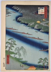
Approximately 70% of Japan’s landscape is mountainous. In the past when travel into the mountains was difficult there was a large demand and great curiosity by the public to see those remote snow covered landscapes. Publishers and leading artists like Hiroshige and Hokusai responded to that demand by ensuring that every landscape set had at least one snow scene and, often, as in the 100 Views of Edo set, there were as many as seven.
Winter landscapes, because of their minimalist nature appeal to a modern aesthetic and are probably the most popular and expensive landscape prints to collect now. They most often show travellers in a snowy pass but we can also enjoy scenes of Edo (Tokyo) under deep snow. Tokyo’s location on the coast of the Pacific Ocean affords the city mild winters with cool spells. Snowfall does occur annually but it is sporadic and it seldom stays. Perhaps there were heavier falls one or two hundred years ago but more likely artists used snow imagery as a way to both emphasise the season and to transform both landscape and cityscape.
In ukiyo-e a number of techniques were used to suggest snow: areas of image were left blank or block cutters and printers created texture on the paper using gauffrage (blind-printing) in which the block is printed without pigment. This convincingly conveyed snow and is primarily found on prints of the Harunobu period and surimono both of which were printed using thick hosho which is ideal for blind-printing.
White pigment was also used: gofun which was prepared from powdered clam shells [calcium carbonate] or shiro prepared from white lead carbonate. Snowflakes could be cut into the blocks and printed; or gofun or shiro could be splashed from a brush onto the paper, or applied by using a right-angle pipette. It could also be applied by taking it into the mouth and spraying through the lips. Splashed pigment is also commonly used to suggest sprayed water.
The shiro usually oxidises over time so that in some prints it appears to be snowing black snow. This is the result of the print’s exposure to air borne acid pollution. Not all oxidation is unpleasant: it can give a print an attractive patina. Print collectors will have noticed another effect of oxidisation- the shiro was also mixed with red for flesh tones which is why one comes across blackened faces on some prints. Oxidation can be easily reversed by a restorer, and once professionally reversed will be stable.
Mori Sosen: One Hundred Monkeys

In the present update is a large painting of one hundred monkeys by Mori Sosen (1747-1824). His life is not well documented but he is known to have studied under the Kano artist Yamamoto Joshunsai (? – 1781) before being drawn into Maruyama Okyo’s (1733-1795) artist circle and his style is more Shijo than anything else. His animal paintings were evidently highly valued by Okyo. He was an immediate favourite with eastern collectors because of his monkey paintings and became known for this subject, although he was more versatile than literature implies and highly accomplished at drawing other animals. But his images of monkeys take precedence and he is considered the pre-eminent painter, east or west, on this subject. He is said to have lived in the woods for three years eating fruit and nuts to study the monkeys and other animals at close quarters. (Even if this is apocryphal it underlines the appreciation of his commitment to understanding the monkey.)
This tour de force of one hundred Japanese macaque monkeys shows every conceivable pursuit. They are the most northern-living monkey and can survive extreme cold.
There are many Sosen monkey paintings but few, as here, are genuine.
Some ways to identify first and early impressions
First and early impressions best convey the intentions of the artist and publisher. High quality impressions can be identified by clear, unbroken key-block outlines, especially on any faces or title cartouches; visible wood-grain – the ‘finger print’ of every Japanese print and the depth of impression, which can often be sensed with the fingertip, especially when thicker, or deluxe hosho was used. The following techniques are indicative of and are best demonstrated on only the earliest editions: Bokashi – subtleties of careful gradation, sometimes merging colours one to another or shaded to give form and depth. Fukibokashi – the spraying of pigments or the splashing of gofun (white pigment). The addition of rice flour or mica to give sparkle to colours.
Example of a First Edition Print: Ichiryusai Hiroshige – “Ferryboats to Zenkoji Temple at Kawaguchi”
How many impressions were produced?
Dealers in ukiyo-e are often asked how many impressions were produced or what is the edition? This is a difficult question to answer because of the limit to the information available to us, however the writings of Mr Tokuno (1893)[1] and Mr Watanabe(1936)[2] give us good insight into the printing process and the number of impressions produced.
Before the 20th century, no Japanese print was numbered except to denote the chapter in a series or a station on a highway. In the 19th century mainstream print production was structured to sell as many copies as possible for modest amounts – some prints being sold then for the cost of a bowl of noodles. Ukiyo-e can be seen to have been one of the most democratic art forms and vast numbers of prints were produced.
The consensus of opinion is that ‘editions’ (ippai) of around 200 prints were pulled concurrently. The number of editions were increased, sometimes substantially, according to the popularity of the design.
Depending on handling and the choice of wood for the block and the pigments used it was possible to produce large numbers of impressions before any discernible deterioration became evident. Too many impressions taken together caused greater wear-and-tear on the blocks and it was beneficial to allow the blocks to rest for several days between impressions. Blocks saturated with pigment became sluggish and erratic in relinquishing the colour evenly. Some pigments, due to their gritty nature, caused deterioration of the blocks.
With optimum handling, printing in excess of 4,000 would have been perfectly feasible before any deleterious signs showed. It is likely that the print numbers for the most popular designs could have been in the region of 20,000. Mr Tokuno, writing in the late 19th century, states that 3,000 sheets could be produced per 8 hour day from the key-block, and around 1,200 to 1,800 from a straight forward colour block, while a colour block needing gradation gave 600 to 700. Experienced printmakers worked with great speed to generate these numbers of prints- it is estimated that to ‘pull’ a colour print it took from 15 to 25 seconds. On the other hand, Roger Keyes’ “guess” at the probable editions for verse surimono, based on a surimono in the British Museum showing a packet of surimono, is 75 to 100 impressions[3].
In the late 19th century wood block printing was competing with copper-plate engraving and photography. There is evidence to suggest that to give even greater speed and quantities, two (or perhaps more) identical designs were cut side by side on the same block and printed simultaneously[4].
[1] – T. Tokuno, chief of the Bureau of Engraving and Printing (Insetsu-Kioku) of the Japanese Ministry of Finance. The Smithsonian Institute, US National Museum, Washington, 1893. Description of the woodblock process, p. 232.
[2] – Watanabe, Catalogue of Wood-Cut Colour Prints, Tokyo 1936, p 72
[3] – Roger Keyes, The Art of Surimono, Sotheby Publications, 1985, pp 36/37, fig. 14
[4] – Comparing impressions of prints by Yoshitoshi for the Yamato Newspaper [publisher: Yamato Shimbunsha; series Kinsei Jimbutsushi, dated: 1886 – 1888] reveals discrepancies in the key-block outline and elsewhere between identical designs which could only be result of re-cutting.
Toyokuni – painted while drunk
In the current update is a painting signed “Toyokuni painted while being drunk.” This is not an isolated example: Certain artists – such as Kyosai – often signed works in this way and indeed may have benefited from a degree of inebriation to prompt inspiration. Artists often collaborated on works, especially of the Shijo school, and one can imagine the conviviality of such a cohors amicorum with food and wine being passed around. It’s difficult to think of a western comparison to this. Hand scrolls, because of their horizontal length and short height, were very suitable for joint efforts of like-minded artists or literati.
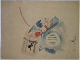
The example in this update is spontaneous – even slapdash – due to the artist’s intoxication, but this adds a charm and veracity to the subject. It also makes authentication easier, certainly of Ukiyoe subjects, as forgers tended to concentrate on copying the detailed, more sober and meticulous subjects, as these were the most highly valued.
Japanese paintings are an undervalued area of collecting. It’s possible, as here, to buy an important Hiroshige painting for the price many of his prints fetch. And one is purchasing an unique item.
Washi – Handmade paper
One of the pleasures of dealing in ukiyo-e is to handle hosho on a daily basis and it is a fact that paper making was already established and used for every imaginable purpose in China and Japan well before Guttenberg was printing the Bible on some of the first western handmade paper.
Hosho, used for printmaking, was manufactured in Echizen and a short- fibred variety of kozo called Nasu Kozo was used. Sumptuous hosho is found on many Harunubu prints and also surimono where a thicker paper was needed to better show off blind printing and where editions were small. Paper is discernably thinner on most Hiroshige sets. Besides kozo, Mitsumata and Gampi fibres were used for paper making but kozo was found to be the most suitable for print making coming from the mulberry family. The trees – in fact one year old sprouts from old stumps – were harvested in December, consequently paper making was an occupation that didn’t interfere with summer farming and the cold weather conditions were also better suited to making paper. The inner white bark of the kozo branches was used to make the bast and this was obtained by steaming the branches and stripping the black and green bark away. The fibre was then boiled in an alkali potash solution to remove the lignin and pectin leaving primarily cellulose fibre. Foreign particles were laboriously removed in cold water (not always successfully as they are found sometimes on 19th century landscapes) The fibre was then beaten or rather loosened to obtain the bast. A mould (su- made of hundreds of rounded bamboo splints woven together with silk threads) was lowered into the vat of bast plus water and a viscous solution of neri (roots from the tororo plant soaked and pounded) to aid formation . An occasional heavier splint gave strength to the mould and this is what is seen when paper is held to the light producing a thinner paper along these strengtheners. Lack of these can be an indication of a later facsimile when machine made paper was used.
For ukiyoe, and especially during the 19th century, a white clay was added to the stock in the vat to lighten the paper and this can cause white blotches to appear over time and are often seen on 19th century landscapes.
The couched paper formed on the su was rolled onto a stack of sheets and very delicately pressed so that the pile weeped. After pressing and parting, the sheets were brushed onto a smooth wooden surface for drying. This gives hosho two distinct sides which can be seen with the eye.
Although print sizes were to some degree determined by the size of the hosho sheets, the primary factor governing formats were the regular government edicts that limited size and thickness.
Why were prints produced in just blue
In the current update there is a Kunisada aizuri-e. Why were prints produced in just blue ?
The history of ukiyo-e is one marked by the development and assimilation of technical innovations in the printmaking process as well as the adaption of the numerous regulations imposed by the Tokugawa bakufu (shogunate) as a result of the economic climate of the Edo period (1600-1868). Mismanagement of the economy by the government and weak Shoguns led to the issuing, intermittently, of regulatory edicts in an attempt to raise funds, to cut spending and to encourage thrift.
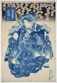
The impression offered here shows all the attributes of the earliest printing: Extremely beautiful and careful wiping of the blue block to render the currents of water; careful modulation of the gradation on the fish at top and also on the sea-weed at the bottom. The later printings – even the first with Matsui Eikichi – lack finesse in the printing of the water and in the republished version there is often no attempt to gradate the foreground sea-weed. The pigments are also of a finer quality on this early state , a better red being used on Cho Jun’s trousers. It was the job of the printers to breathe life, so to speak, into the image, to give form and depth by means of skilled bokashi; to augment a design by wiping on clouds or spraying pigment to imitate dust or snow. This all took time rather than relying on a key-block outline and blocks of colour.The only other difference, of course, between early and late printings is the quality of the impression. The more prints that were pulled, the more the blocks wore down producing weak outlines.
These decrees were also frequently aimed at raising moral standards, and as ukiyo-e – related as it was to the less esteemed merchant class – prospered, it became one of the prime targets of the government. The bakufu viewed the widespread appeal and production of ukiyo-e as a barometer of the excesses of the period, and also as a potential instrument which could be used to satirize the establishment. Prohibitions were placed on paper quality, pigments, the number of blocks to be used, as well as subject matter. These statutes were, at certain times, vigorously applied, but depending on prevailing economic conditions, short-lived. Nonetheless resourceful publishers, and perhaps artists and artisans, were quick to find ways of evading them. In this way ukiyo-e periodically underwent a change, usually resuming its original form after the relaxation of the edicts, but having added further techniques and imagery to its repertoire. Two examples are the benigirai-e (red-hating pictures) and aizuri-e (prints produced almost entirely in blue) which were the outcome of edicts limiting colours on prints and books. Aizuri-e were issued in response to the Tempo Reforms of the early 1840s (Tempo era, 1830-44), and reached, in some cases, a high degree of sophistication, using as many as five blocks with varying hues of blue and only the smallest area of, usually, red.
Cho Jun and Ri Ki wrestling underwater
In the new offerings is a vertical Yoshitoshi diptych of Cho Jun and Ri Ki wrestling underwater. This is the earliest known state of what is considered one of Yoshitoshi’s best designs – before the first publisher’s name (Matsui Eikichi) and date (20,2,1887) in lower left margin was printed. This gives an opportunity to examine the differences in printing between the earliest and last editions. (The diptych was subsequently reprinted by Hasegawa Tsunejiro in 1,9,1887.)
From the late 18th century there was a history of publishing some prints in a deluxe edition and a more affordable version of the same design: Paper, pigments and nuances in printing could all be adjusted. And by the time we come to some of Hiroshige’s better known sets we find the first editions had great care lavished on them with extra bokashi (grading the pigment by hand), better pigments and paper. The Hundred Views of Edo is a prime example of this: Every care was taken to convey the atmosphere of a scene. Later editions lack these subtleties with commercial considerations taking precedent. This is certainly true of many of Yoshitoshi’s sets as well.
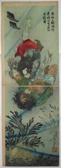
The impression offered here shows all the attributes of the earliest printing: Extremely beautiful and careful wiping of the blue block to render the currents of water; careful modulation of the gradation on the fish at top and also on the sea-weed at the bottom. The later printings – even the first with Matsui Eikichi – lack finesse in the printing of the water and in the republished version there is often no attempt to gradate the foreground sea-weed. The pigments are also of a finer quality on this early state , a better red being used on Cho Jun’s trousers. It was the job of the printers to breathe life, so to speak, into the image, to give form and depth by means of skilled bokashi; to augment a design by wiping on clouds or spraying pigment to imitate dust or snow. This all took time rather than relying on a key-block outline and blocks of colour.The only other difference, of course, between early and late printings is the quality of the impression. The more prints that were pulled, the more the blocks wore down producing weak outlines.
A Twist of Figured Cloth – Shunga wood blocks
This is the first of an occasional blog that I hope clients will find interesting.
In the current update is an important and rare set of six original wood blocks for a shunga (erotic) book Aya no odamaki “A Twist of Figured Cloth” by Terasawa Masatsugu (active c1760-1790) published in 1776 in black and white, so these are the key-blocks (or sumi-blocks) which constitute reversed or mirror-images of the book.
It is pure serendipity that a few original blocks have survived. Many were planed down to recut as wood became more expensive during the 19th century and a lot more were probably used for kindling or destroyed by fire. There is also an apocryphal story that the Victoria and Albert Museum, here in London, burnt a large number of blocks after the Second World War to free up storage space. Early blocks, such as these, are particularly rare. Blocks that survive with big names attached – Harunobu or Hiroshige, for example, are invariably for copies. Shunga blocks are of added rarity. Indeed, this is the only set I have seen . The blocks have a great beauty in their own right and are from the wood of the single-petaled white mountain cherry (shiro-yamasakura or Prunus mutabilis).
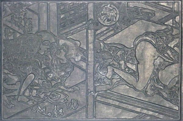
During the Edo period outlines were cut following the direction of the brush strokes of the original drawing, the knife being drawn towards the block-cutter. The block- cutter followed the drawing (hanshita-e) which was pasted face downward onto the block and partially peeled or rubbed with hempseed oil to render it more visible. Cutting was deeper in the 18th century and became shallower during the 19th, probably due to the cost of wood and the gradual sophistication of the cutters. In Japan wood was cut with the grain; this method is fundamentally similar to western chiaroscuro woodcuts, hence the operation is one of relief printing as opposed to intaglio. The impression from the grain of the wood-block was transferred to the paper during printing and is visible on early impressions – an infallible way of recognising genuine impressions rather than copies.
Colour prints used proofs from the key-block to make the colour blocks and were keyed by the simple expedient of marks (notches) cut in the block on the upper and lower left corners. Cutting of a set of blocks could take two or three days while complicated sets were finished within twenty days.
The blocks are priced separately to give as many collectors as possible the opportunity to acquire one, and would sit well with any serious collection of prints, books or shunga.